Tent vs marquee economies (or why Indonesia is bad and Vietnam is good)

I previously looked at the SE Asia economic picture overall and drew out some pretty stark contrasts. I want now to focus specifically on two markets I know well, both of whom have cheerleaders: Indonesia and Vietnam. Only one of them, I would suggest, has a bright future. Against these, as ever, I find it useful to benchmark against China, the one regional example of an economy that has made progress.
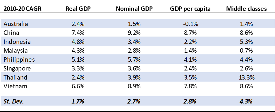
In fact, based on statistics previously discussed, even in a basic way Indonesia has constantly under-performed Vietnam (and indeed most peers) over the period 2010-2020:
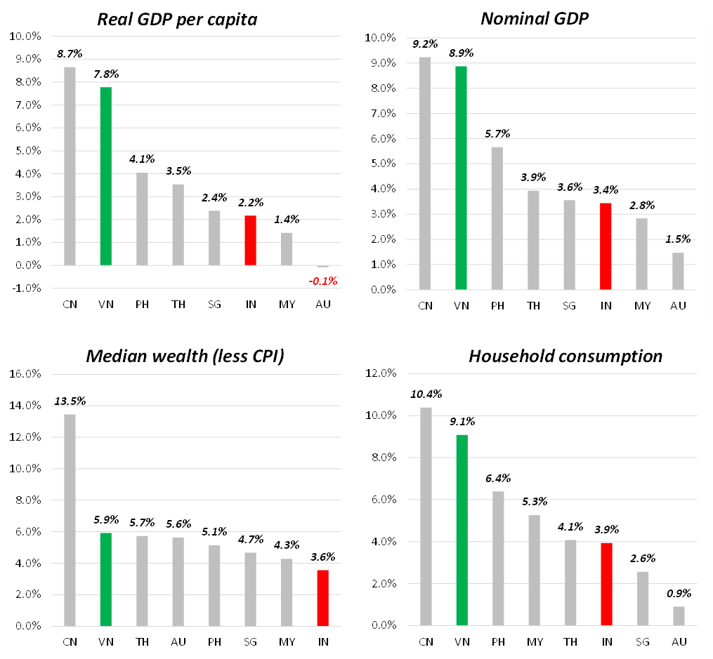
It is poignant that once we move beyond real GDP, the variation is marked. Both Indonesia and Vietnam have experienced significant population growth – but even factoring that in, Vietnam has sped ahead on a per capita basis. In terms of nominal GDP, Vietnam comes close to China levels of growth and, incidentally, does so with a currency which has not depreciated against the dollar anywhere near as much. In median wealth, Vietnam, coming from a low base and with CPI not much less than Indonesia, is still notably ahead. And lastly in household consumption – that portion of GDP growth that we consider “good growth” – Vietnam is more than double Indonesia even though the latter experienced the greater part of a commodity boom during the period. In other words, Vietnam, from a standing start, has led everyone in the region bar China; and is the only country to come close to matching China’s remarkable overall levels of growth.
So much for the past – but what about the future? Well the problem comes in understanding the structure of the economy, and in particular the effects of inequality, inflation and where relevant, currency depreciation. Indonesia’s under-performance is due to both a long-standing inequality and inability to distribute the proceeds of growth into a mass middle class, as well as peculiar governmental weakness at tackling inflation and currency depreciation, which are linked.

As a demonstration of the former, I tend to use my own measure of inequality, which is to look at the “wealth multiple” of mean-to-median assets per capita. The higher the multiple, the more unequal the economy. I find Gini coefficients to be too muted in their outcomes, and most of the public sources such as the World Bank still inhabit a pre-Piketty world focusing on income distribution rather than asset distribution – but all this will be in a future post. What is important is how much higher Indonesia’s wealth multiple is compared to the two post-Communist economies which are doing better (for the record, others such as the Philippines are unsurprisingly even worse). Both Indonesia and Vietnam have experienced high levels of inflation – but, of course, this comes against the background of Vietnam’s much higher rates of nominal GDP growth. And above all, whilst most of currencies have weakened against the dollar, none have been so spectacular in their depreciation as the Rupiah.
2020 exports by industry for Indonesia (left) and Vietnam (right)

Indonesia has been sustained by commodity cycles in the past and may benefit from another which has recently commenced – but the problem is, this is only arrow in its quiver. For me, there are two broad models of economic emergence, which I visualise as “tents” and “marquees”. A tent is simple, and has a couple of simple poles which hoist the whole fabric. These poles can raise a high summit point, but they are frail and narrow. A marquee takes longer to assemble, but has multiple poles and is usually more robust. Indonesia’s reliance on commodities – and its marked inability to produce an export-quality value-adding sector (for instance, manufacturing) – makes it a tent. Vietnam, whilst its summit point is still lower than that of Indonesia, is supported by multiple sectors. Importantly, this also means producing a wider “middle”, which somewhat depicts the creation of a real middle class.
Tent vs marquee models of economic development

In short, whether you are an entrepreneur, a foreign investor, or just the common man on the street, Vietnam is a much better prospect than Indonesia. This reality belies the generic theoretical focus on demographics and real GDP, and correlates to the empirical and anecdotal evidence from the streets. Anyone who goes to Jakarta and then Saigon will feel a difference in energy and enterprise. In Indonesia – much like Thailand or the Philippines – a few rich incumbent families own practically everything. Jakarta, by another shorthand metric I like to use, has no pavements: the rich go by car and the poor have nowhere to go. Saigon has middle classes who walk around urban landscapes. Likewise, the streets of Saigon are full of absurd little shops where the emerging consumer is upgrading their life (not anything I would personally buy, but nonetheless); Indonesia instead has little between the gleaming malls and the warung.
From a business level, it shows through as well: the long-hoped-for mass ownership of four-wheel vehicles in Indonesia has never really materialised – passenger car growth over the decade is half that of China and Vietnam, and behind even Thailand. Modern retail (for instance hypermarkets) has never yet had its day in the sun, instead being swamped with by the low-end providers like Alfamart and Indomaret. Banking has not had the traction expected, particularly in additional services; but meanwhile low-end app-based financing is common place. And at the end of the day, Indonesia’s new economy champions still tend to feel much lower in quality of management than even their regional competitors – Go-Jek vs Grab, for instance.
The reasons for all this are manifold, and would warrant a full academic paper (although some of the topics around cultural traditions may not even make it past the censors of modern publishing). But what is clear is that, following from the previous post, there are better and worse markets and Vietnam and Indonesia, often compared together amidst a group, are good examples of this contrast. I would hazard that Indonesia’s presumed consumption take-off may simply never materialise. People talk of Indonesia sitting at the heart of the revolution in EVs – which is questionable – but even if it happens this may never feed through to the population. Certainly, alone amongst the beneficiaries of the last commodity boom over 2006-2012, Indonesia saw little gain for median families, and such wage growth as came was washed out by its rampant inflation. Indonesia seems destined only to be constantly extracted from, by local families or foreigners. Personally, if I had a dollar to invest today, the choice between these two is pretty clear.