It has been a year since Trump entered the White House, and eighteen months since the Brexit vote. Yet the media still display an astonishing lack of understanding about several aspects both of US wage stagnation, as well as how it interacted with voting.
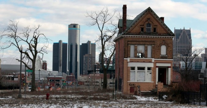
The Brookings Institute came out with an important piece recently which has not received the attention it deserved. They produced five maps, showing the winners and losers in median wage change across the US between 1999 and 2016. Some of the results are obvious: the first map, of “winners”, shows that wages in the tech hubs and in government subsidised DC have done rather well; the last map, showing where wages have done the worst – step forward Detroit amongst others – is also a well-worn narrative.
But it is the penultimate map which should be most concerning. I have long argued that American liberals take far too narrow a view of poverty, and see the role of government as essentially providing urban answers to urban problems, which are the most visually obvious to those inside the Beltway. This ends up focusing on helping ethnic and other minorities, albeit usually in a less-than-constructive method. Altogether ignored is where much of the real poverty lies – as this map shows:

It repays some close study. The problem areas are not Detroit or Flint or Cleveland. The problems are that 10 urban areas of over 1 million inhabitants – and another 59 towns of between 100,000 and 1 million – have experienced median wage declines of 10% – 15% over the period. On the basis of this study, that’s 50 million people constituting the single largest group, and are not all names you would expect:
While the group contains a handful of large Sunbelt metro areas still laboring to rebound from the late 2000s housing crash (e.g., Miami, Orlando, Phoenix, Tucson) and a few major industrial centers in the Midwest (e.g., Chicago, Indianapolis, Milwaukee), small- to mid-sized urban areas predominate in this category. Most are manufacturing centers that lost significant numbers of middle-income jobs in the 2000s that have not been replaced, including 10 urban areas in Wisconsin, six each in Michigan and Ohio, and five each in Georgia and Indiana. A few have shown some green shoots in the 2010s after a rough decade, including Ann Arbor and Kalamazoo in Michigan, and Oshkosh in Wisconsin. Others, however, have slipped considerably since 2009, such as Charleston, W.Va., Davenport, Iowa, and Springfield, Ill.
This reinforces two lessons. The first is that the often quoted cliché about urban vs rural voters is a false one; neither America (nor Britain) are about large urban centres. By my last count, well fewer than half (43%) of Americans lived in conurbations of over a million people. Fewer again (33%) lived in cities of over two million. The genuinely rural population is also small (15%). Instead, real American life is about small market and post-industrial towns.
Politics focused on what happens in New York or LA, and contrasted perniciously against what happens “out on the ranch”, is not helpful to anyone. Reporters and politicians know all about the urban indigent, even if they do not do much about it; but they seem to know nothing of the small-town working poor. That is what Trump and Sanders were all about. It is also the case with Britain, as was identified in an excellent piece in 2007 by Blair Freebairn.
The obsession with reporting on urban areas is one I have discussed before in relation to media misinformation about street protests in the developing world.
Neatly compact urban street protests are highly photogenic and easily captured on camera. Crowds sell news … It is difficult for outside observers to empathize with anyone other than those who are so passionately occupying the capital. It also involves much greater effort and investment in time – time which is not afforded by the twenty-four hour news cycle.
The great tragedy is that the same misguided focus is applicable at home, where we discovered last year that journalists who should know better, did not.
The second lesson is the danger of economists and economic commentators continue to fall victim to the intellectual Tyranny of the Mean, whereby average numbers still form the focus at the expense of median data. What I should hope is by now a very commonly seen chart shows the disparity which still leads to the incredulous question: “who are all these poor white people?”

There is little sense in technocrats informing voters that their economy has been growing, or that living standards have been rising, when no-one recognizes it as such. The disparity shown here is not only obvious as a chart, but more importantly in how voters feel about the economy. Median calculations are not perfect, but a good starting point would be for all economists to rethink along median lines each and every time they put out a statistic or indicator.
All said and done, it seems to me most liberals have still not grasped the underlying lessons of the last few years. Obama, of course, had precisely zero to say on the issues that would come to dominate 2016 – he barely seemed curious about such trends, for someone so supposedly intellectual. Fighting the urban-rural battle is to continue the last war. Small white towns are where it’s at right now, and telling them they’ve been doing okay is not going to win any votes.
